Tuesday 31 August 2010

Market Breadth: Part I

Market breadth refers to the level of participation behind market moves.  There are several ways of measuring market breadth but in this series of posts I'm going to focus on something called the advance/decline percentage.

The advance/decline percentage is calculated on a daily basis and determines the proportion of stocks that are rising in value versus falling in value.  The specific calculations is as follows:

 Advance/Decline %  =  (# of Advancing Stocks  -  # of Declining Stocks) / # of Stocks

For example, if we have a hypothetical market that comprises of 10 stocks and 7 of these stocks have risen in value on a particular trading day then the advance/decline percentage will be:

(7 - 3) / 10 = 40%

This tells us that 40% more stocks were increasing in price than were decreasing in price. Alternatively, if a majority of stocks have fallen in value, say 8 stocks, then the advance/decline percentage will be:

(2 - 8) / 10 = -60%

In this case there were 60% fewer stocks rising in value than were falling in value.

So, as you can see, if the advance/decline percentage is greater than zero a majority of stocks are rising in value and if it is below zero a majority of stocks are falling in value.  The zero level represents equality between the number of rising and falling stocks.

Because the daily advance/decline percentage moves very fast it is typical to use a moving average to smooth the results.  For this series of posts I've applied a 20-day moving average to the raw daily advance/decline percentages.

Below is a chart of the DFM General Index and corresponding advance/decline indicator.

As you can see, the 20-day advance/decline indicator oscillates around the zero level (right axis).  When the advance/decline indicator is above zero (green shaded area) this signifies that a greater number stocks are rising in value than falling.  The more the indicator rises above the zero level the greater the proportion of stocks that are rising versus falling.

When the advance/decline indicator is below zero (red shaded area) this signifies that a majority of stocks are falling in value. The further the indicator is below zero the greater the proportion of stocks that are falling versus rising.

As you might expect, when the DFM General Index has been rallying it has been accompanied by a positive 20-day advance/decline percentage.  In bear markets the 20-day advance/decline percentage tends to be negative with a majority of stocks falling in value.

There are two main ways to interpret and use the advance/decline indicator.  The first is to use extreme advance/decline levels as an indicator of potential market turning points.  The logic here is that when a very high percentage of stocks are participating in a market move this is unsustainable and will be followed by a market reversal.

The other main use is to look for divergences between the advance/decline indicator and market prices.  For example, if market prices are making new lows but the advance/decline indicator is not then this might signify a bottom for the market and higher future prices. The logic behind this use of the advance/decline indicator is that where fewer stocks are participating in a market decline this shows a lack of support for that move and a likely turning point. The opposite is true for rising markets.

In future posts I will examine the validity of both uses of the advance/decline indicator on GCC equity markets.  To begin with, however, I've tested a simpler use of the indicator which has yielded positive results across all GCC markets.

The chart below shows the performance of the DFM General Index under different advance/decline conditions:
(Note: Results are uncompounded and do not include fees or dividends)
The blue line in the chart above is the price of the DFM General Index since 2004.  The green shows the performance of the Index when the advance/decline indicator was positive and higher than it was two weeks ago.  The green shows the performance of the Index when the advance/decline indicator was negative and lower than it was two weeks ago.

I arbitrarily chose these rules but they seemed quite intuitive (to me at least). My reasoning was that if a majority of stocks were participating in a market rally and the number of stocks participating was increasing this would be bullish for the future price direction. On the other hand, if a majority of stocks were participating in a market decline and the number of stocks participating is that decline was increasing this would be bearish for future price direction.

The results above show that these simple rules were reasonably effective in identifying periods of increasing and decreasing market prices. The future performance of the DFM General Index when the advance/decline indicator was positive and higher than two weeks ago was bullish (green line).  However, the future performance of the DFM General Index tended to be bearish when the advance/decline indicator was negative and lower than it was two weeks ago (red line). 

These results were fairly consistent across all GCC markets and I'll present them in Part II.  In Part III of the market breadth series I'll introduce a study which I'll use ongoing basis to monitor the advance/decline indicator and it's implications for future market price action.

Enjoy.

Sunday 29 August 2010

September Seasonality

September's just around the corner so I thought I'd analyse the historical performance of the GCC markets during this month.

For international equity markets September has been the weakest month of the year.  On average, since 1950, the S&P 500 Index has lost about 1% during September.  I wanted to see if this effect was the same for the GCC equity markets.

The chart below shows the average daily percentage change for each GCC market during each calendar month.


There are a couple of things of note.  Firstly, aside from January, the first half of the year is typically the best period for GCC equity markets.  The strongest months are February, March, April and August.

Secondly, the worst performing months, by some distance, are October and November. That's a big tendency to overcome for anyone who's advocating a year end rally.

As far as September is concerned, however, there isn't much to note apart from the strong performance of the Dubai market during this month.  On the whole, though, September has tended to be a mixed month for GCC equities.  The good news is that the data above doesn't seem to correspond with how international equity markets tend to perform during this month. Phew!

Enjoy.

P.S. As with the previous Ramadan Effect post I have to point out that we're dealing with a very small data set for this analysis.  My data only goes back as far as 2004 for GCC equity markets so there have only been six or seven prior instances of each calendar month. It's hard to draw any concrete conclusions from such a small data set.

Saturday 28 August 2010

Weekly GCC Index Analysis (Week 36)

Weekly Index Analysis for week ending 26th August 2010 (25th August 2010 for Saudi Tadawul Index).

Enjoy.

Weekly GCC Trend Analysis (Week 36)

[ Click to enlarge ]

[ Click to enlarge ]

[ Click to enlarge ]

[ Click to enlarge ]

[ Click to enlarge ]

[ Click to enlarge ]

[ Click to enlarge ]

Notes:
1. In the  "Current Trend Conditions" section the short-term, medium-term and long-term trend values are determined by dual moving averages.  The trend value is "Up" when the the shorter length moving average is greater the longer length moving average. The trend value is "Down" when the the shorter length moving average is less then the longer length moving average. For more information on dual moving averages see previous post here.
2. Dual moving average parameters are specific to each index and time-frame (short, medium and long).
3.  The "Outlook" value can be "Very Bullish," "Bullish," "Neutral," "Bearish" or "Very Bearish."  The value is determined by the historical performance of the index when the same short, medium and long-term trend conditions were in evidence in the past.
4. The top chart shows a plot of the historical price performance of the index.  Highlighted on the chart are the past periods when the current trend conditions were in evidence in the past
5.  The bottom chart shows the non-compounded percentage returns of the index when the current trend condition were in evidence in the past. 

Friday 27 August 2010

GCC Movers & Shakers

A quick look back at this week's big gainers and losers.

Enjoy.

Thursday 26 August 2010

UPDATE - Saudi Tadawul Index: Watch Out Below?

In a previous post I highlighted how the price level of the Saudi Tadawul Index was sitting rather precariously on a long-term support trend line.

Well, a few weeks have past so I thought I'd take another look to see what's happened:


As you can see, the Index price level has recently broken below the support level.  Does this mean Saudi stock prices are heading lower?  As I mentioned in the last post, I don't place too much emphasis on this type of analysis.  However, I know there are many traders and market analysts out there that do and they'll being interpreting this situation as distinctly bearish.

It's interesting to note that in the most recent Weekly GCC Trend Analysis report the outlook for the Saudi Tadawul Index was very bearish with the short, medium and long-term trends all pointing down.  Perhaps the confluence of this and the trend line break above do suggest tough times ahead for Saudi stocks.  Something to keep in mind anyway.


Enjoy.

Wednesday 25 August 2010

Is There A Ramadan Effect?

We're now well into the Muslim holy month of Ramadan.  In this post I'll take a look at how the GCC markets tend to behave prior to, during and after Ramadan.

In my six years living in Dubai the two comments I hear most with regards to Ramadan and the stock market are:
  1. Nothing much happens during the Ramadan and equity prices don't move much
  2. After Ramadan the market tends to be bullish with stock prices increasing
It's not difficult to see the perceived logic in these comments.  Many people tend to take holidays during Ramadan so there are less traders and investors active in the market resulting in subdued price action.  However, when everyone returns after Ramadan there is renewed activity in the market which tends to result in increasing stock prices.

I want to test these ideas to see if and  to what extent they're accurate.  To do this I've looked at the Dubai, Saudi and Kuwaiti equity markets.  Specifically, I've analysed the direction of prices (did they go up or down) and the volatility or prices (how much did they move) for each market index during Ramadan, 20 trading days prior to Ramadan and 20 trading days after Ramadan.

Firstly, let's take a look at the percentage change in the DFM General Index during, prior to and after Ramadan.


As you can see, price movements during Ramadan (approx. 20 trading days in duration) have tended to be positive with the DFM General Index increasing in value in 5 out of the last 6 years.  The 20 trading days following Ramadan have also been positive but less so than during Ramadan and with only 3 of the last 6 years producing price increases.  The average price change in the 20 trading day prior to Ramadan has been slightly negative.

Let's take a look at the same data for the Saudi and Kuwait indexes:


For both Saudi and Kuwait the average price change during Ramadan has been positive whereas the price change in the 20 days after Ramadan has been negative, significantly negative in the case of Kuwait with only one post Ramadan period producing an increase.

On average, the 20 trading days prior to Ramadan have both been positive, outperforming Ramadan price increases for Kuwait and underperforming for Kuwait.

Given the above results I think we can say the following with regards price direction during and around Ramadan:
  1. Index prices have tended to rise during Ramadan
  2. Index prices during Ramadan have tended to perform better than the 20 days following Ramadan
I think this debunks a lot of what I'm used to hearing people say about Ramadan and stock prices.  If anything, based on the above analysis, Ramadan is often a reasonable month for stock prices whereas the period following Ramadan is often not.

Next, let's look at the volatility of price changes during, prior and after Ramadan.  To do this I calculated the percentage range of index price movements during the three periods.  For example, if an index was trading at 100 at the beginning of Ramadan and achieved a high of 125 and a low of 75 during Ramadan, the percentage range would be 50% ( [High-Low] / Starting Value = [125-75] / 100)

The percentage range is just a way of determining the volatility of price changes.  High percentage values tell us that prices moved significantly whilst low percentage ranges tell us that prices were quiet, moving in narrow ranges.

Again, let's start by looking at the results for the DFM General Index:


As you can see, I've formatted the table so that high percentage ranges are in dark green and lower values are in light green.  What do the results tell us?  Well, the average price range prior and during Ramadan were very similar, 12.35% versus 12.89%.  However, the range following Ramadan was significantly greater indicating an increase in volatility during this period.

The same results apply to the Saudi and Kuwaiti Indexes as well:


The range of prices during the 20 trading days after Ramadan are higher than the price changes during and prior to Ramadan.  For Saudi and Kuwait the average price range was also higher during Ramadan than in the period prior to Ramadan.


Putting It All Together

Continuing the list of observations above we can now note the following:
  1. Index prices have tended to rise during Ramadan
  2. Index prices during Ramadan have tended to perform better than the 20 days following Ramadan
  3. Index prices tend to increase in volatility during the 20 days following Ramadan

Based on this analysis price movements during Ramadan are not particularly muted in terms of either direction or volatility.  The 20 days after Ramadan tend to produce more volatility but not necessarily on the upside as is often thought.

Following Ramadan I'll update the above tables to see if this year's index price movements are in-line with the above results.  An important thing to note when interpreting the above results, however, is that we're dealing with only a few data points.  The market data that I have available only goes back to 2004 so we're only looking a six data points for each index (2004 to 2009).  This isn't enough to assign much confidence in the results. Certainly not enough to based trades upon.

That said, I think we can say that the typical views about Ramadan and stock price movements are not borne out by the analysis above.

Enjoy.

Monday 23 August 2010

DFM Stocks: Year-to-Date & Weekly Returns

A quick data visualisation of the returns for DFM stock returns last week compared with their year-to-date returns.

Although it fell 1.7% last Aramex has been best performer so far this year with a 8.9% return.  Deyaar fell 3.2% last week and is down a miserable 48% for the year.


Enjoy.

Sunday 22 August 2010

Weekly GCC Index Analysis (Week 35)

As you'll see, I'm still playing around with the format for the Weekly Index Analysis. Any comments or feedback is much appreciated.

Enjoy.
Weekly Index Analysis for week ending 19th August 2010 (18th August 2010 for Saudi Tadawul Index):


Weekly GCC Trend Analysis....Now Includes Qatar (Week 35)

Some readers contacted me to ask why Qatar was missing from the weekly Trend Analysis and Index Analysis reports.  This wasn't an oversight, it was simply because I didn't have the necessary market data to perform the analysis.

Happily, however, I've now got my hands on the data so, going forward, Qatar will be included in all reports.

Enjoy.

P.S.  See "Notes" section at the bottom of the post for an explanation of the Trend Analysis report.

[ Click to enlarge ]

[ Click to enlarge ]

[ Click to enlarge ]

[ Click to enlarge ]

[ Click to enlarge ]

[ Click to enlarge ]

[ Click to enlarge ]

Notes:
1. In the  "Current Trend Conditions" section the short-term, medium-term and long-term trend values are determined by dual moving averages.  The trend value is "Up" when the the shorter length moving average is greater the longer length moving average. The trend value is "Down" when the the shorter length moving average is less then the longer length moving average. For more information on dual moving averages see previous post here.
2. Dual moving average parameters are specific to each index and time-frame (short, medium and long).
3.  The "Outlook" value can be "Very Bullish," "Bullish," "Neutral," "Bearish" or "Very Bearish."  The value is determined by the historical performance of the index when the same short, medium and long-term trend conditions were in evidence in the past.
4. The top chart shows a plot of the historical price performance of the index.  Highlighted on the chart are the past periods when the current trend conditions were in evidence in the past
5.  The bottom chart shows the non-compounded percentage returns of the index when the current trend condition were in evidence in the past. 

Friday 20 August 2010

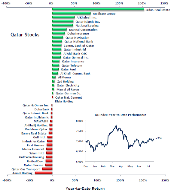
Qatar Stocks: Year-to-Date Performance

Tuesday 17 August 2010

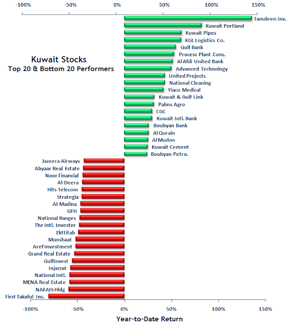
Kuwait Stocks: Best & Worst Year-to-Date Performers

Monday 16 August 2010

Weekly GCC Index Analysis (Week 34)

Note: See the following post for an explanation of the GCC Weekly Index Analysis and how to interpret it: Understanding the GCC Weekly Index Analysis

[ Click to enlarge ]

[ Click to enlarge ]

[ Click to enlarge ]

[ Click to enlarge ]

[ Click to enlarge ]

[ Click to enlarge ]