Monday 31 January 2011

Fox News Covers the Egypt Crisis

This one speaks for itself:


What do you expect, it's Fox News.

Enjoy.

Sunday 30 January 2011

UAE Stock Monitor

The pre-opening market activity for Dubai and Abu Dhabi stocks is indicating a sizable drop this morning.

Regional markets are going to be dominated by what's happening in Egypt.  At the moment the focus is on when and how the current president is "relieved of his duties."  But assuming Mubarak does go the focus will then turn to who and what type of government replaces him.  And the answer to that is none to clear at this point in time.

This uncertainty and the potential for more dominoes to fall is going to put pressure on GCC markets and probably global markets as well.

That said, below are some performance stats for UAE stocks based on Thursday's close.  If stocks do end up being whacked today, however, the picture could change substantially.

Enjoy. 

Key:
  • Close Price: weekly stock closing price
  • Weekly Change:  prior week's percentage stock price change
  • Price > 50-Day Moving Average: is the Close Price greater than previous 50-day average price
  • Price > 200-Day Moving Average: is the Close Price greater than previous 200-day average price
  • Volume > 20-Day Average: is the current volume greater than the previous 20 days average
  • Current Price versus 20-Day Range: where is the current price in relation to the previous 20 days

[ Click to enlarge ]

[ Click to enlarge ]

Saturday 29 January 2011

Unrest in Egypt Spooks Saudi Market

Clearly, the situation in Egypt has made investors in Saudi very nervous.  The Tadawul Index dropped 6.43% today with volume spiking to levels not seen in well over six months.

Saudi Tadawul Index Falls 6.43%

With such a decisive fall you'd expect the other GCC markets to follow Saudi's lead when they open tomorrow.

Unsurprisingly, the countries in the eye of the storm have seen their stock prices sell-off considerably.  The Egypt 30 Index fell by more than 10% on Thursday alone.

Also, oil futures rose by nearly 5% on Friday. That's the biggest one day rise since September 2009.

In short, the financial markets are nervous about the situation in Middle East and the possibility of further contagion in the region.  Things are moving quickly and no one is sure what will happen next. And as everyone is fond of saying, markets hate uncertainty.

Enjoy.

Saudi Stock Monitor

The tables below show the following for each Saudi stock:

  • Close Price: weekly stock closing price
  • Weekly Change:  prior week's percentage stock price change
  • Price > 50-Day Moving Average: is the Close Price greater than previous 50-day average price
  • Price > 200-Day Moving Average: is the Close Price greater than previous 200-day average price
  • Volume > 20-Day Average: is the current volume greater than the previous 20 days average
  • Current Price versus 20-Day Range: where is the current price in relation to the previous 20 days

[ Click to enlarge ]

[ Click to enlarge ]

[ Click to enlarge ]

[ Click to enlarge ]

[ Click to enlarge ]

[ Click to enlarge ]

[ Click to enlarge ]

[ Click to enlarge ]

[ Click to enlarge ]

[ Click to enlarge ]

[ Click to enlarge ]

[ Click to enlarge ]

[ Click to enlarge ]

[ Click to enlarge ]

[ Click to enlarge ]

Enjoy.

Friday 28 January 2011

Aldar on the Edge (Not Any More)

At the beginning of the week I noted how the stock price of Aldar Properties was teetering on the edge, at the 2 dihram level.

Well, it's not any more. The 2 dihram level offered no support and stock fell to a new lifetime low of 1.81 by Thursday's close.  Aldar finished down 11% for the week and is now down 20% since the start of the year (and an eye watering 86% from its 2008 all time high).


Enjoy.

Weekly Market Analysis (Week 5)

The weekly market analysis pages have been updated for trading week 5 (January 29th - February 3rd).  Use the links below to view the individual market analysis pages:

Dubai   -   Abu Dhabi  -   Saudi   -   Kuwait   -   Qatar   -   Bahrain   -   Muscat

The table below shows the market outlook based on each study.
Visit the links above to view the full analysis reports for all GCC markets.

Enjoy.

Sunday 23 January 2011

Aldar on the Edge

How the mighty have fallen.  Aldar Properties joins a steadily increasing list of UAE companies that have required financial assistance. 

But Aldar is significant in that it is the first big Abu Dhabi company to get itself into trouble (from my knowledge, anyway).  We're used to this kind of thing with Dubai companies but Aldar's situation shows that problems exist further afield.

One analyst report I read claimed that Aldar wasn't the subject of a bailout but was just raising funds, like any other company might do.  So, Aldar's a bit like Facebook then.  Just raising a bit of capital

Well, bailout or not, Aldar's stock price is teetering on the edge.  As the chart below shows the current stock price is sitting at the 2 dihrams level.

Aldar Properties - Abu Dhabi Stock Market

The two previous times Aldar's share price has visited this level (late 2008 and mid 2010) the stock has rallied. And what about this time? Under the circumstances you would think it's probably going to be a case of third time unlucky. 

What Aldar does could be important to the wider Dubai and Abu Dhabi markets. Aldar is a heavily traded stock and if breaks below the 2 dihram level that could impact sentiment for other stocks.

Time to keep an eye on Aldar, even if don't own it right now.

Enjoy.

Friday 21 January 2011

Weekly Market Analysis (Week 4)

The weekly market analysis pages have been updated for trading week 4 (January 22nd - January 27th).  Use the links below to view the individual market analysis pages:

Dubai   -   Abu Dhabi  -   Saudi   -   Kuwait   -   Qatar   -   Bahrain   -   Muscat

The table below shows the market outlook based on each study.
Stock Market Outlooks: Dubai, Abu Dhabi, Saudi, Kuwait, Qatar, Bahrain, Muscat
 Visit the links above to view the full analysis reports for all GCC markets.

Enjoy.

Saturday 15 January 2011

Qatar Market in Overbought Territory

The Qatar market continues to advance higher.  The QE Index is up 9% since the 2022 World Cup announcement on December 2nd.  Clearly there's a lot of optimism surrounding Qatar at the moment.

However, the Relative Strength Index (RSI) is signaling that the Qatar market is in overbought territory.  For those not familiar with the RSI see here.  In short, the RSI is a momentum measure that oscillates between zero and 100.  When the RSI is below 30 this signals that the stock or index is oversold.  When the RSI is above 70 this signals an overbought stock or index.

That chart below shows the QE Index (top chart) along with the 14-day RSI indicator (bottom chart).  The green shaded area represents oversold RSI levels and the red shaded area overbought levels.


Qatar Stock Market Relative Strength Index
As you can see, the RSI for the QE Index is currently above 80, well into overbought territory.  Does this mean a big sell-off is imminent?  Not necessarily. When a stock or market does get this overbought it is certainly vulnerable to a sizable sell-off.  For example, the first two overbought occurrences highlighted on the chart above resulted +10% market falls.

But more recent overbought levels have just been met with a pause or mild pullback prices. So, on its own, a high RSI level isn't a reason to sell (especially when the weekly market analysis of the Qatar market is so bullish).  However, entering the market at such overbought levels probably isn't a good idea either and certainly wouldn't provide a good risk-to-reward trade.

At the very least when the RSI level for a stock or index is above 70 this should be taken as a "proceed with caution" signal.  With that in mind below are the Qatar stocks with the highest current RSI levels.

Qatar Insurance Relative Strength Index


Qatar International Islamic Bank Relative Strength Index


Qatar Islamic Bank Relative Strength Index


Masraf Al Rayan Relative Strength Index


United Development Co. Relative Strength Index
Enjoy.

Friday 14 January 2011

Weekly Market Analysis (Week 3)

The weekly market analysis pages have been updated for trading week 3 (January 14th - January 20th).  Use the links below to view the individual market analysis pages:

Dubai   -   Abu Dhabi  -   Saudi   -   Kuwait   -   Qatar   -   Bahrain   -   Muscat

The table below shows the market outlook based on each study.
Stock Market Outlooks: Dubai, Abu Dhabi, Saudi, Kuwait, Qatar, Bahrain, Muscat
Visit the links above to view the full analysis reports for all GCC markets.

Enjoy.

Wednesday 12 January 2011

Wall Street vs Main Street

Do you keep hearing about the disconnect between Wall Street and Main Street?  Well, the chart below does a nice job of quantifying this disconnect.

The blue line is the S&P 500 Index (Wall Street) and the green line is the Consumer Confidence Present Situations Index (Main Street) which measures overall consumer sentiments toward the present economic situation.

Over the past 20 years the two time series have displayed a high degree of co-movement.  However, since March 2009 an interesting and unusual divergence has occurred. The S&P 500 Index has rallied by over 50% since the March 2009 bottom whereas consumer confidence has remained at historic low levels.

Why the disconnect?  Well, I think stock markets and asset prices in general have been buoyed by the Fed's quantitative easing activities (see this previous post on the relationship between the Fed's Treasury purchasing program and the S&P 500 Index).  However, Main Street continues to experience high unemployment and a depressed housing market.

But whatever the reasons for the disconnect the more important question is what comes next?  If the S&P 500 Index continues to rise can we expect a rebound in consumer confidence?  If consumer confidence remains low or falls further will this drag the S&P 500 Index down?  Or is the relationship between stocks and consumer sentiment broken?

My hunch it that the current disconnect between Wall Street and Main Street will continue. I'm not expecting some stellar rebound in consumer confidence or a market collapse.  But in the longer run something will have to give.

Enjoy.

Tuesday 11 January 2011

GCC Market Breadth Performance Review

This is the second in a series of posts evaluating the performance of the studies presented in the weekly market analysis report (see first post here).

This post will look at the performance of the market breadth analysis.  Market breadth is measured using the 20-day advance/decline indicator.  When the advance/decline indicator is greater than zero this tells us that more stocks have risen in price than fallen.  When the indicator is less than zero more stocks have declined in value. (See the following post for more details on this indicator and how it is calculated: Part I, Part II and Part III)

On the charts below I've highlighted the market breadth for each GCC Index from August to December 2010.  The green shaded areas denote periods when market breadth was positive and red shaded areas are the negative breadth periods.

Dubai Stock Market Breadth

Abu Dhabi Stock Market Breadth

Saudi Stock Market Breadth

Kuwait Stock Market Breadth

Qatar Stock Market Breadth

Bahrain Stock Market Breadth

Muscat Stock Market Breadth
I think it's fair to say that the charts above show that the market breadth analysis has done a pretty good job of identifying bullish and bearish periods.
Here are the actual performance figures:
Stock Market Breadth Performance
Under positive market breadth (first column) GCC markets have tended to perform strongly, much more so than when breadth was negative (second column).

For example, under positive market breadth the DFM General Index returned +21.79% whilst the Index lost -9.40% during negative breadth periods.

The performance during positive market breadth periods beat total index returns (third column) for 5 out of the 7 GCC markets. 

In conclusion, as with the trend analysis I reviewed in the last post, market breadth has performed very well over the past 5 months.  For all GCC markets positive breadth has been associated with rising index levels whilst negative breadth has been associated with falling for flat index levels.

Enjoy.

Monday 10 January 2011

Looking Behind the US Unemployment Figures

As you've probably heard by now the unemployment rate in the US dropped from 9.8% to 9.4% in December.  That's the biggest single month drop in twelve years and lowest unemployment level since May 2009.   President Obama was quick to highlight this figure to the US public as proof that the economy was recovering.  "The trend is clear" he said.

Well, the US economy may well be improving but trends are rarely so clear.  The problem is that headline figures, such as the unemployment rate, almost never tell the whole story. 

For example, it's true that the US labour force did grow by 103,000 jobs in December.  However, industry analysts were expecting a rise of 150,000 jobs and for the unemployment rate to drop 0.1% to 9.7%. So how did the US economy add fewer jobs than expected but the unemployment rate fall so dramatically?

Time for a chart courtesy of the Calculated Risk blog:

The red line shows the headline unemployment rate.  As you can see, the rate has begun to fall from its recent highs.  However, the other two lines are revealing.  The blue line is the participation rate. This is the percentage of working age persons that are in the labour force. The black line is the ratio of ratio of employment to the US population.

Both the participation rate and employment to population ratio are at levels not seen in over 25 years.  In December alone 260,000 people dropped out of the labour force.  These are the long-term unemployed who have essentially given up looking for work. These people are no longer included in the unemployment figures.

And when so many people leave the labour force the headline unemployment figure gets skewed. In this instance the fall in unemployed was exaggerated due to the large decline in the participation rate. 

In this light the unemployment figure don't seem so good.  And consider this. The US economy must add about 125,000 jobs each month just to keep up with normal population growth. 

Or how about this: it will take about 175,000 new jobs to be created each month over the next five years just to make up for the ones that have been lost during this recession.

We can all be glad that the US economy is now growing and adding jobs.  But if there's one thing that is clear it's that the pace of recovery is very sluggish. That's not the upbeat media soundbite that Obama is looking for,  but it is the truth.   

Enjoy.

Saturday 8 January 2011

GCC Trend Analysis Performance Review

I've been putting out the weekly market analysis report (in some form or another) for a few months now so I thought it was time to take a periodic look at how each study has performed.

This post will look at the trend analysis performance. As quick recap the trend analysis uses three dual moving averages to determine the current short, medium and long-term trends.  For each GCC market the current trend conditions are compared to previous instances.  If the market has tended to increase in value during previous instances then the predicted outlook is Bullish.  If the market has tended to fall the predicted outlook is Bearish whilst if there is no directional price tendency the outlook is Neutral.

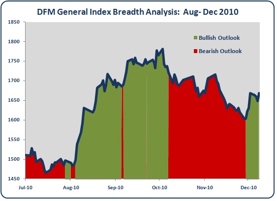
On the charts below I've highlighted the trend outlooks for each GCC Index from August to December 2010.  The green shaded areas denote periods when the trend analysis was forecasting a Bullish outlook.  The red shaded areas denote Bearish outlook periods and the pale yellow areas are for Neutral outlooks.


Just from eyeballing the charts you can seen that the trend analysis has done a reasonable job of identifying rising and falling market moves.

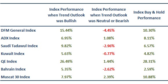
For the number lovers the table below shows the actual performance figures:
The first column shows the percentage return of each GCC index during periods when the predicted outlook was Bullish.  The second column is the percentage return during periods when the predicted outlook was either Neutral or Bearish.  The final column shows the total percentage return for each index from August to December 2010.

The most important takeaway from these figures is that the performance of each market during Bullish outlook periods was significantly better than the performance during the combined Bearish and Neutral periods. This confirms that the trend analysis has managed to predict rising and falling market moves for the GCC markets.  Additionally, the performance during Bullish outlook periods beat total index returns for 4 out of the 7 GCC markets.  Not bad, especially over such a small period of time (Aug-Dec 2010).

In conclusion, the trend analysis looks to be working well and is successfully predicting bullish and bearish market action.

Enjoy.